
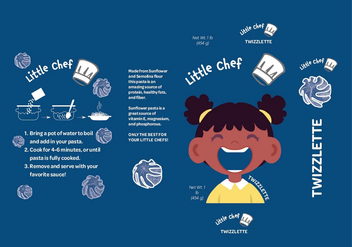
Little Chef
This semester-long project provided me with the opportunity to develop a brand from the ground up. It was centered around the design of new pasta shapes that could be extruded or hand-shaped. My overall goal, however, was to challenge myself with a bigger project that incorporated multiple design techniques and skills.
How can I develop a food brand that encourages children to learn about and experiment with different culinary techniques?
The Little Chef Brand is an adventurous Pasta brand designed to foster happy and healthy eating. Made from sunflower and semolina flour, the pasta contains healthy vitamins that support developmental growth. This project will continue to expand as I develop tools, a website, and experiment with other cuisine designs.
Duration:
16 Weeks
Tools:
Illustrator
Photoshop
Adobe InDesign
Fusion 360


Consumer Research
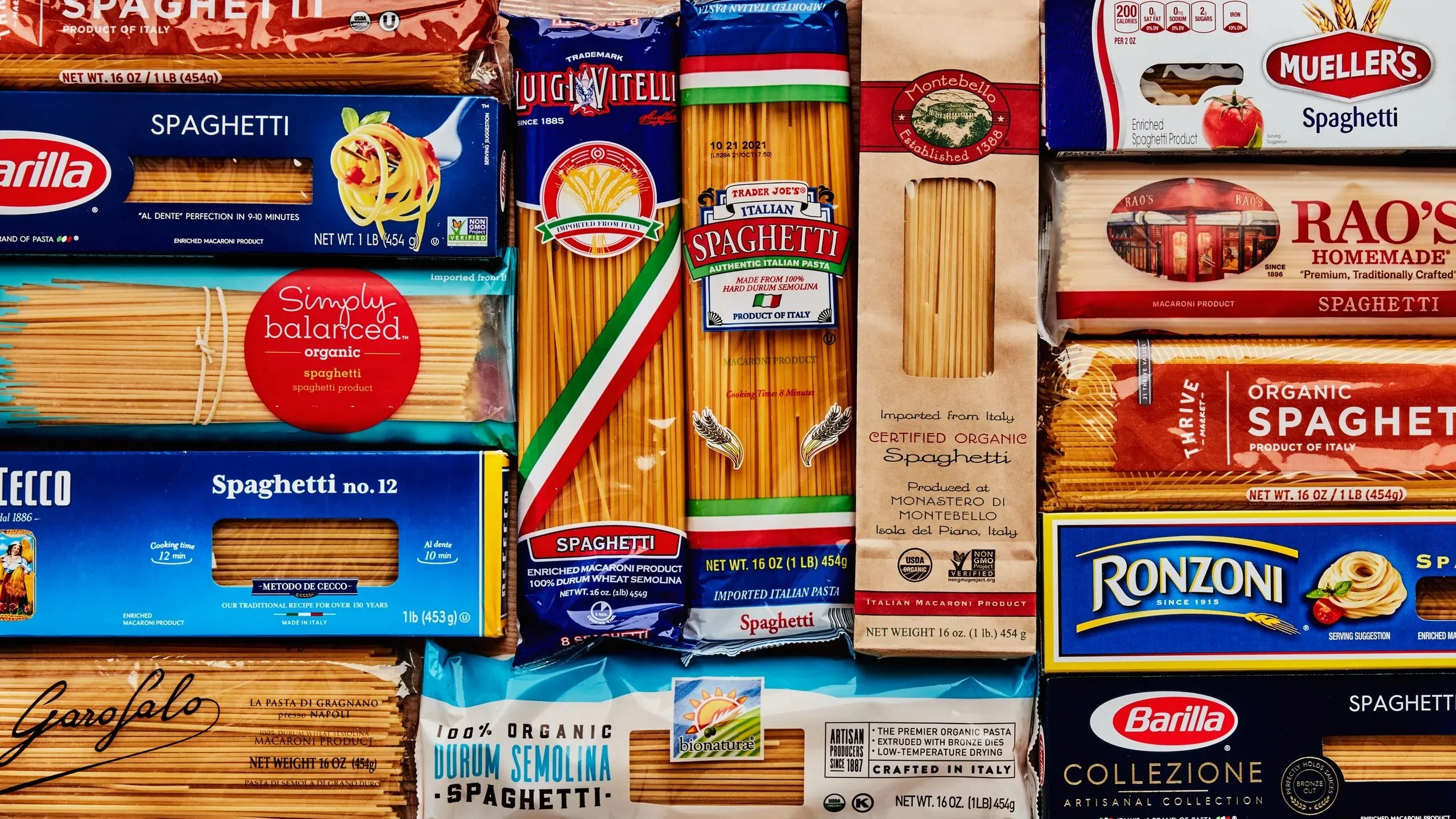

I enjoyed finding designs that featured interesting cutouts that matched the branding without being a simple rectangle. I felt that these openings best captured and emphasized the personality of the brands.

Many food brands appeal to adults and feature sleek, professional designs that often do not visually resonate with young children. For my design, I aimed to take a more entertaining approach to the packaging.
IDEATION
I began my brand ideation by developing a sense of the overall brand and experimenting with its personality. I drew inspiration from professional pasta-cutting tools. And created a sticker design that feels inviting and playful.


DESIGN EXPERIMENTATION

To appeal to children and also produce a fun and inviting brand, I drew inspiration from the messy eating habits of children. I began by experimenting with the facial expressions and the sizes of their mouths. I decided that a larger mouth opening would be better for displaying the pasta shapes with a softer, happier expression.


PUTTING IT TOGETHER


After experimenting with the personality, I decided to go further with the playful side of the brand. I felt that the overall brand needed to develop a better connection with its consumers in a way that allowed children to feel as though the brand were designed specifically for them.
FONT EXPERIMENTATION
final Packaging design
-
![]()
Bowzies
-
![]()
Twizzlette
-
![]()
Veloppe


Many bulk packaging features boxes packaged in larger boxes. To maintain the inviting and playful aspect of the overall packaging, the bulk packaging features a tote with windows that allow customers to see the pasta shapes within each box.

BOX DIELINE
CuT
CRease

